The Skoda brand is a brand that has been present in automotive history forever and has been characterized by the development of new advances and cutting-edge technology. Like the brand, the Skoda-logo it is a symbol that perfectly reflects all the milestones of the brand.
Today we are going to delve a little into history, so that you can understand what is the skoda logoits meaning and the way it has evolved through more than 125 years of history.
What is the Skoda logo?
The Skoda logo symbolically represents the plume of feathers on the head of an Indian, which later becomes a winged arrow. It is a symbol that represents success in competition, honor, credibility and above all the representation of speed. The authorship of the first logo remains hidden until now.
What is Skoda?
Škoda is the name of one of the oldest existing European car manufacturing companies and are the Most prestigious modern car manufacturers in the Czech Republic. The brand manufactures middle-class cars and urban cars, which compete in excellence with the cars of German brands.
Skoda cars are popular all over the world and are considered a guarantee of quality, comfort and durability. Skoda have made a good number of cars, such as sedans and passenger cars, as well as buses, trucks and agricultural machinery.
Although the Skoda company is considered Czech, since it historically appeared on the territory of the Czech Republic, this car manufacturer is called a division of the German automotive company Volkswagen, which in 1991 bought part of the brand.
some history
The roots of the brand go back to the year 1895. After a broken bike, the founders decided to start their own production, focusing on quality, reliability, and affordability. In 1898 Laurin & Klement began manufacturing bicycles and a year later motorcycles, which soon became popular and received several awards.
Skoda has its origins in the Laurin and Klement brand, which in 1895 began to manufacture bicycles and a year later motorcycles, which became popular and received several awards. Subsequently, was acquired by Skoda Works, which was a large industrial conglomerate, founded in 1859, which continued to make cars under the Skoda name.
In 1939 the company became the main car manufacturer in Czechoslovakia., but it is forced to supply the German military needs during the occupation of the Second World War. After the war, the company returns and begins to design various successful car models.
But In the North American market, the company is unable to establish itself solidly in the market and concentrates on Europe. In 1991, Volkswagen bought a large part of the brand and injected capital for its development with the idea of making it one of its manufacturers.
Skoda later begins to build larger and better-equipped models, based on the Volkswagen range, thus becoming a highly competitive brand throughout Europe.
Skoda logo evolution
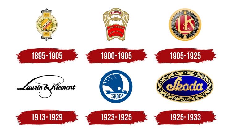
Logo Skoda 1895 -1905
The first Skoda logo was a wheel with a black outline, beige in color and with a transverse rectangle on top. At the top of the rectangle, in a yellow area read the words ‘V Laurin & V Klement’. Underneath, they placed the writing ‘Mlada Boleslav’.
In the rectangle, there was a circle divided into zones of yellow, white, red, and yellow. There, they wrote ‘Scavia’ in black, in an all-caps sans serif typeface.
Logo Skoda 1900 – 1905
In the year 1900, a dark beige badge with white ornamental lines is introduced. It had a white area in the center that they divided into 2 ovals that resemble wings. At the top, it reads ‘Slavia’ in gold. Below, a red wavy rectangular area.
Logo Skoda 1905 – 1925
The name Slavia disappeared from the logo, as did the names of the company’s founders. In the center, they drew a red area with the monogram ‘L&K’ surrounded by a laurel wreath.
Logo Skoda 1913 – 1929
A very minimalist logo is featured compared to the other versions. It was just the names of the founders written in a fine, artistic cursive.
Logo Skoda 1923 -1925
In 1923 Skoda introduced the first rendering of the iconic winged arrow. It was drawn in solid blue on a white background and enclosed in a thick blue circular frame. This flying arrow design represents the rapid advancement and application of modern technologies in products.
Logo Skoda 1925 -1933
This logo is represented by the design of an oval that is oriented horizontally in an electric blue color, which has a golden border and a laurel ornament that surrounded it. The brand name continued to remain in the center.
Logo Skoda 1925 -1933
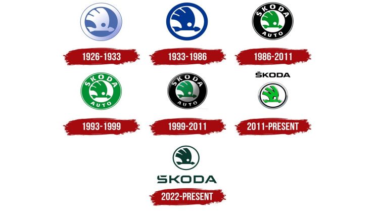
The modernized design of a wind arrow was introduced, executed in a gradient color palette of white and blue, with no lettering on the insignia. The logo looked voluminous and elegant, which made it stand out from the list of the competition.
Logo Skoda 1933 -1986
The 1933 restyling made the Skoda logo look flat and shiny, drawing the arrow and the frame in blue, with a color that contrasts perfectly with the white background.
Logo Skoda 1986 – 2011
The logo changed its main color to green and placed a black circle around it, with the inscription SKODA Auto.
Logo Skoda 1993 – 1999
In 1993, the logo changed: two rings on the frame became light green. The main element, the winged arrow, acquired the same hue. The name Skoda Auto remained within the green circle.
Logo Skoda 1999 – 2011
The logo design is modernized, giving a metallic color to the white parts. Some volume was given to the other elements. The shape and color scheme of the logo did not receive changes.
skoda logo 2011
A new logo design was introduced with the arrow redesigned in a bright green hue, outlined in gradient silver. This with the intention of making it voluminous, and set against a white background, enclosed in a double black and silver frame with no lettering.
Skoda logo 2022
A radical change is introduced in the logo design, with a different color palette, making the emblem light green. It shows a surreal aspect that reveals the innovative nature of the brand, showing a futuristic and innovative aspect. All the elements of the logo are drawn with bold flat lines, in a single color.


